Pivora
A data management and visualization dashboard designed to give teams full control over their pipeline — from deal tracking and company management to rich, interactive data views that make complex information instantly readable.
- Category
- UI/UX Design
- Client
- Pivora
- Year
- 2026
- UI/UX Design
- Product Design
The project.
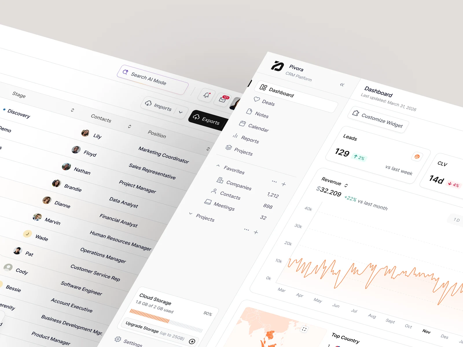
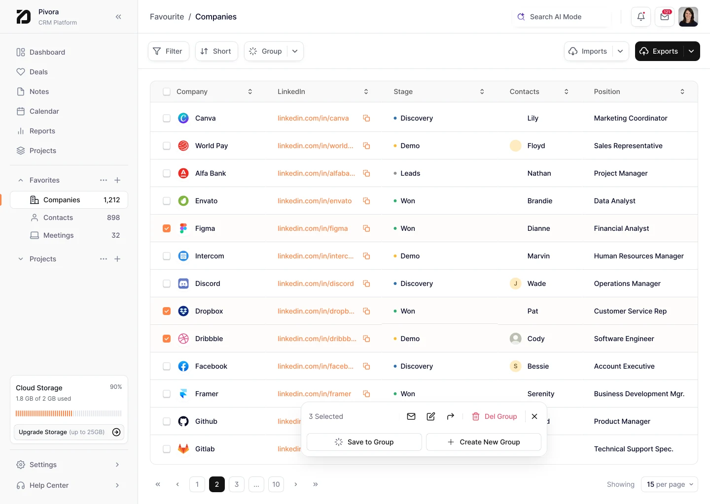
Pivora is a data management and visualization platform built for teams that live inside their pipeline. The challenge was designing an interface that handles high-density information — companies, deals, contacts, and analytics — without ever feeling overwhelming.
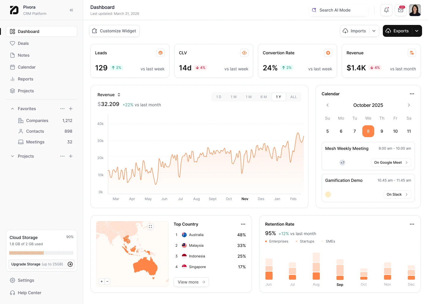
We centered the experience around a unified dashboard that gives users an at-a-glance read of what matters most. Every metric, status indicator, and data point was positioned with deliberate hierarchy so users can scan quickly and act without hunting.
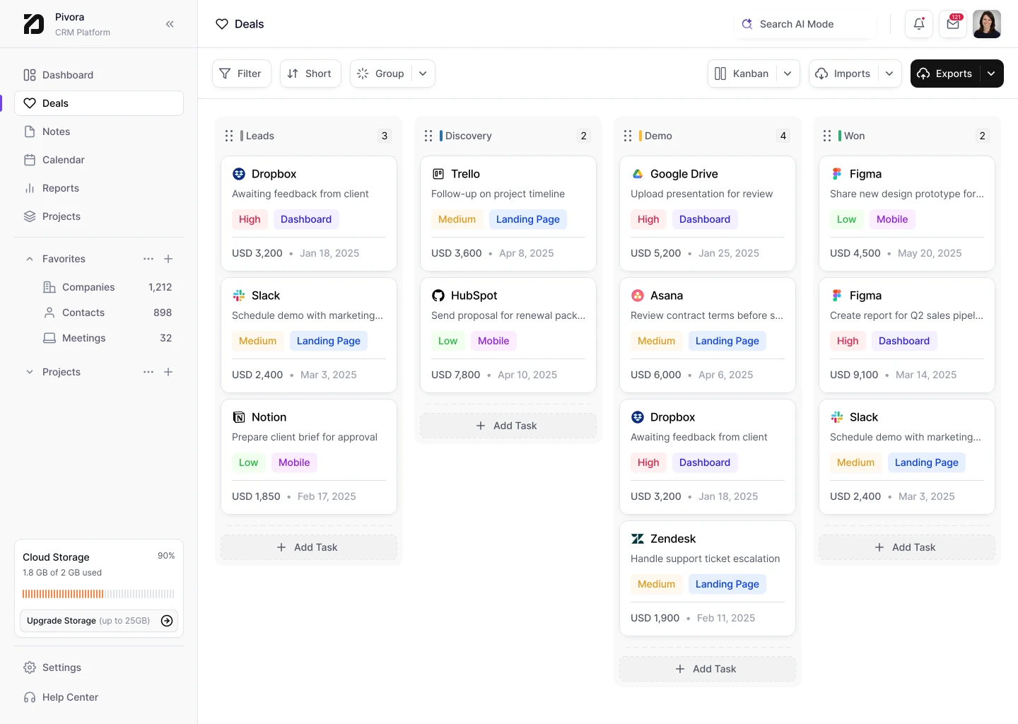
The deals view and company management layer were designed to work in tandem. Selecting a company surfaces a contextual popup with enriched detail — contacts, deal history, activity — without breaking the user's place in the broader list.
Data visualization was treated as a core output, not a bolt-on feature. Charts and summaries are embedded inline with the data they describe, making the relationship between raw numbers and visual context immediately clear. The result is a dashboard that earns trust by making complex data feel organized and under control.
What we shipped.
Unified dashboard with clear hierarchy across deals, companies, and metrics
Contextual company popup for enriched detail without losing list context
Inline data visualization connecting raw data to visual summaries
High-density interface designed for speed and daily operational use
Want something like this?
We can help scope, design, and ship your next product sprint.