brand guidelines
The signature, the mark, colour, type and every file you need, in one place, so anything with Syrup’s name on it looks like it came from the studio.
If you need a file that isn’t here, or you’re not sure something fits the brand, email hello@syrup.dev and we’ll help.
introduction
Syrup Studio is a product team in Brisbane. We design, build and launch software for startups, and we sign our work the way a person would: in pen.
- Name
- Syrup Studio. Just “Syrup” once you’ve said it once.
- Website
- syrup.dev
- Based
- Brisbane, Australia
- Voice
- Plain, warm and specific. We say “we”.
- Look
- Light pages, one blue pen, a serif for titles, a field of glyphs behind the top of each page, real screens.
strategy
One idea, said the same way everywhere: we’re the product team you hire by the month.
The product team you hire by the month.
We ship to your product every week.
We deliver best-in-class digital solutions.
- One plain line in the serif, lowercase, then a paragraph or two in grey.
- Facts before adjectives: what ships, how often, what it costs.
- End on one thing to do, usually “Book a call”.
logo
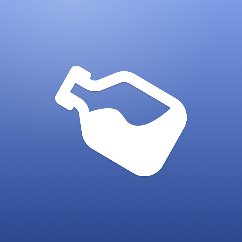
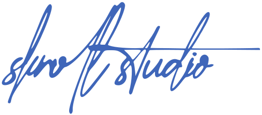
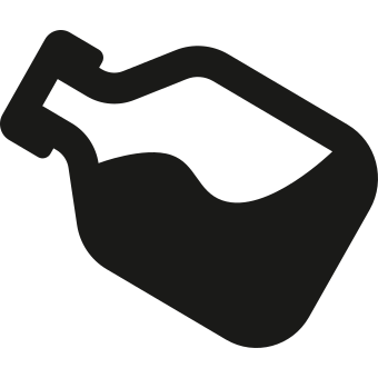
The pen signature is the logo. The bottle mark on its blue tile stands in wherever there’s only room for a square.
- Keep the signature at least 120px wide on screen and 30mm in print, so the strokes hold together.
- Pen blue, white or ink only. No gradients, outlines or shadows on the signature.
- Never stretch, rotate, retrace or retype it.
- Set it on white, pen or ink, not on busy photos.
typography
Geist Serif for titles, Helvetica Neue for everything small, Rethink Sans inside the sheets, Switzer Light for client names and Geist Mono for the field.
Geist Serif
Titles and section names, Regular 400, lowercase. Headlines 28–32px, section names 24px, plan names 20px.
Helvetica Neue
Everything small, Regular 400: paragraphs 16/26, labels, buttons and facts 14/22. Numbers in Medium 500.
Rethink Sans
Inner pages and sheets, Regular 400. Medium 500 only on buttons and nav.
Switzer Light
Client names, set as text instead of logos: Cap, Efferd, Thrive House.
Geist Mono
The field’s glyphs, 13px in 14px cells, and the signature at the foot of the page. Nowhere else.
colour
White paper, dark ink and one blue pen. The blue marks moments; it never fills a whole page.
- Pen#3F66B9The signature, app tiles, the field, the one accent
- Pen light#7C9CE6Top of the tile gradient
- Pen deep#2B4891Bottom of the tile gradient
- Ink#1A1A18The bottle mark, dark surfaces
- Title#1C1C1CStatements and names
- Text#5C5C5CSmall text, quiet sentences
- Line#E5E5E1Hairlines between rows
- Paper#FFFFFFEvery page
- Paper 2#F6F6F3Panels behind screens
- Chip red#E2364DThe calendar chip, nowhere else
field
Behind the top of every page, a field of glyphs in pen blue: a quiet texture that never sits still, a few soft shapes drifting across, and the pointer leaving a trail. It fades out before the work begins.
- Geist Mono in 14px cells, in pen blue only, from 13% to 56% opacity.
- Seven glyphs from faint to dense: · : - = + * # . Texture uses the first two; shapes, trails and clicks reach the end.
- Lighter down the reading column, so the words stay easy to read, and gone by the end of the opening section.
- On banners it stays to the edges and corners, clear of the words and of where a network puts the profile picture.
- One still frame under reduced motion.
images
Real screens from real products, set on soft grey panels. No stock photos and no device mockups.
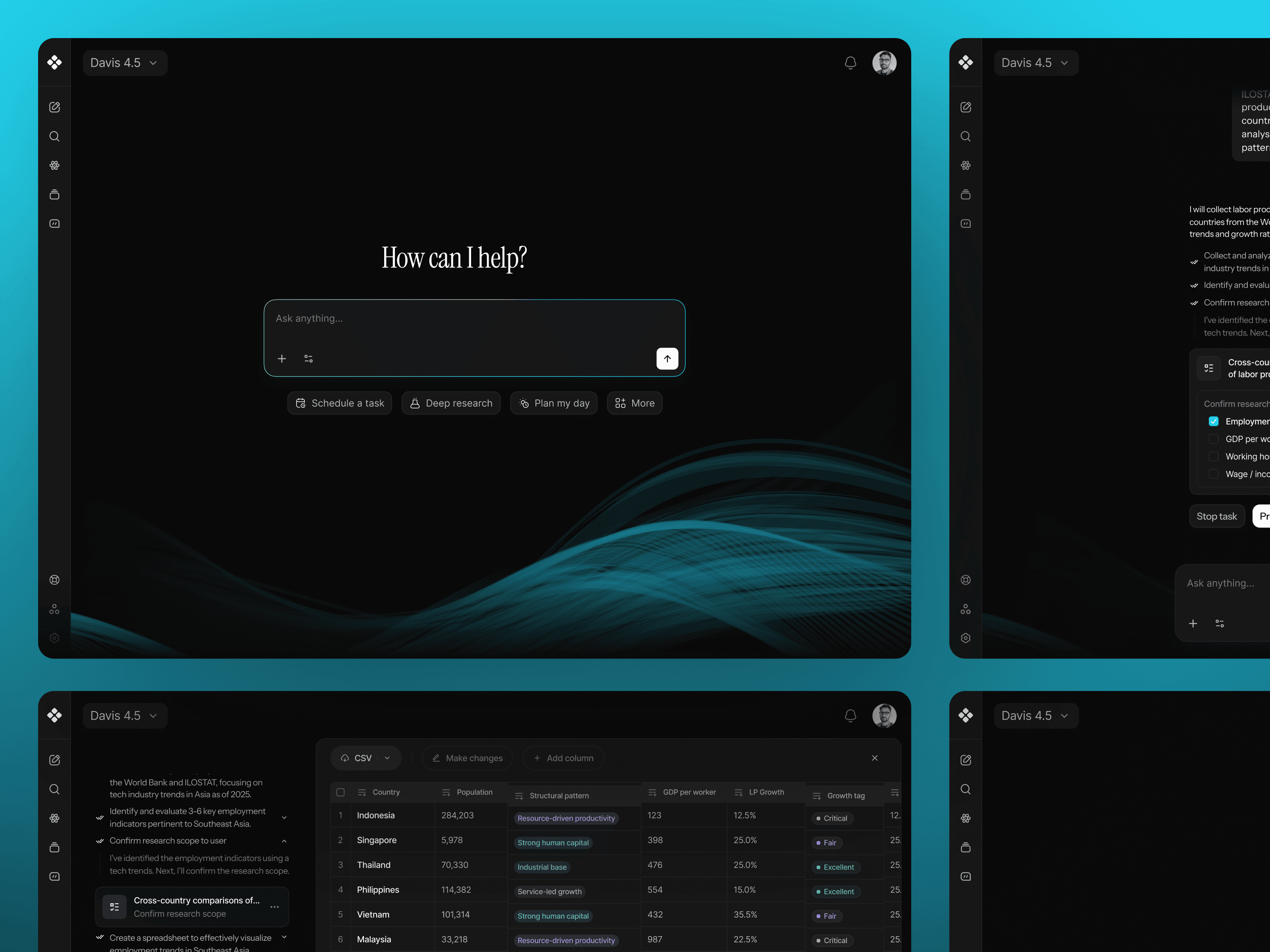
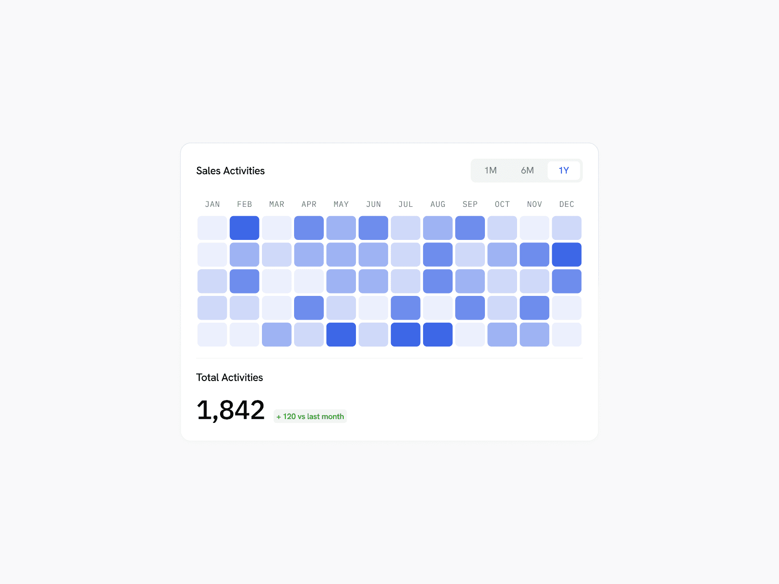
- Show the actual product, at its real size where you can.
- Panels are Paper 2 with 22px corners.
- Founders appear as round portraits, and only with their OK.
icons
Every product gets an app tile: a smooth-cornered square, a top-lit gradient and a white glyph.
Syrup ships to your product every week , and founders hire us by the month.
- Continuous corners (a 22.37% radius with 60% smoothing), never a plain rounded square.
- The glyph fills the middle 60% of the tile.
- The gradient runs light at the top to deep at the bottom.
resources
Banners for X, Facebook and LinkedIn, the share image and the logo files, every one drawn from the site’s own artwork by one script so they match the pages. Use these rather than screenshots.
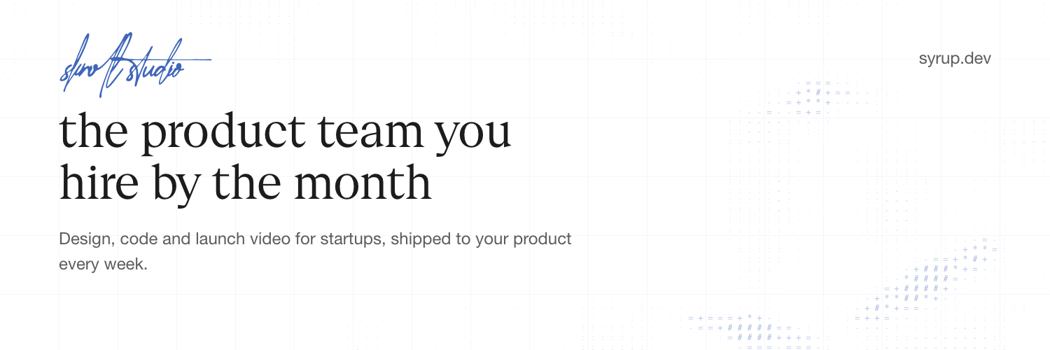
X header, 1500 × 500. Download the 2× file below 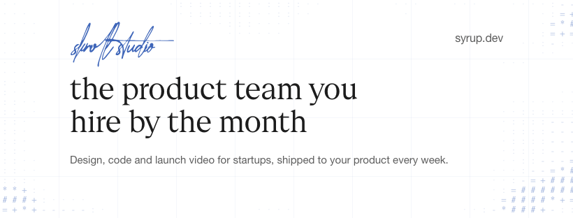
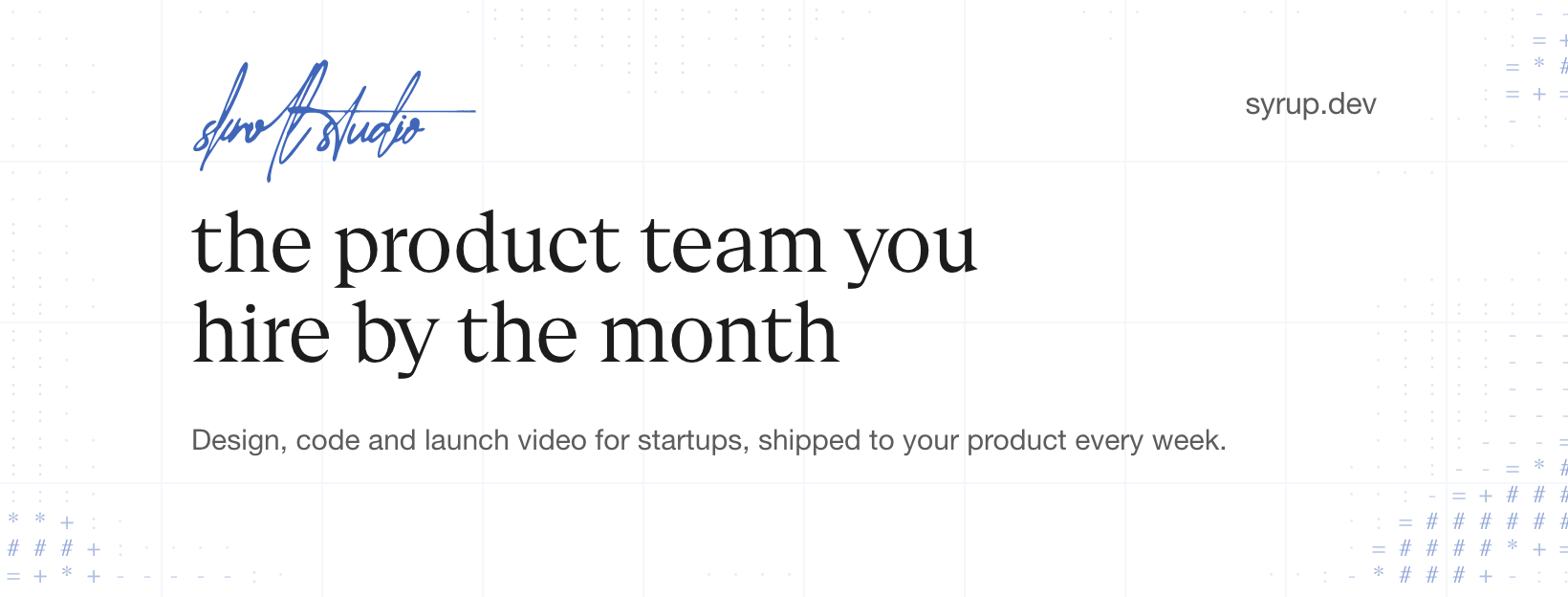
Facebook cover, 820 × 312. Download the 2× file below 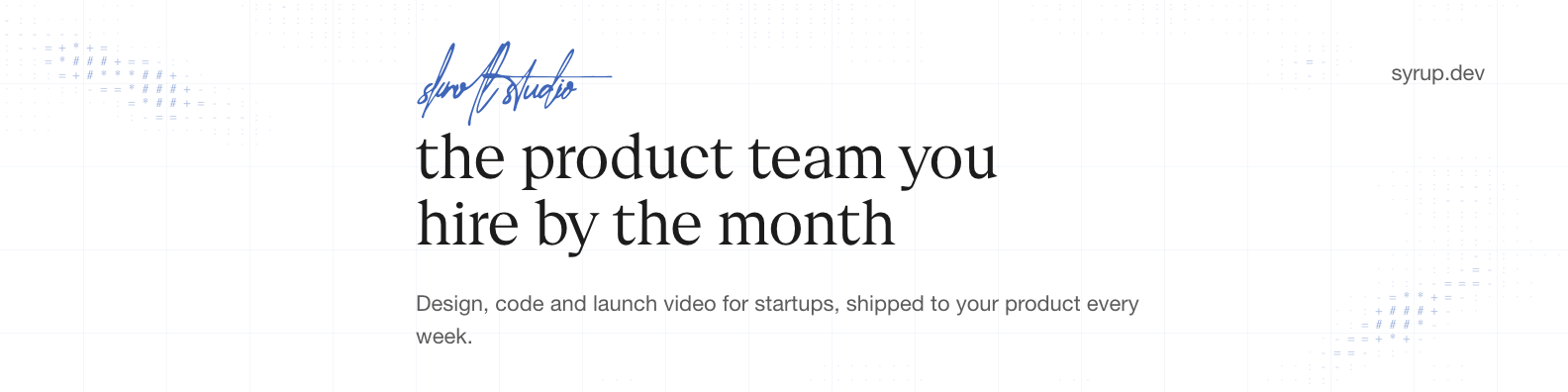
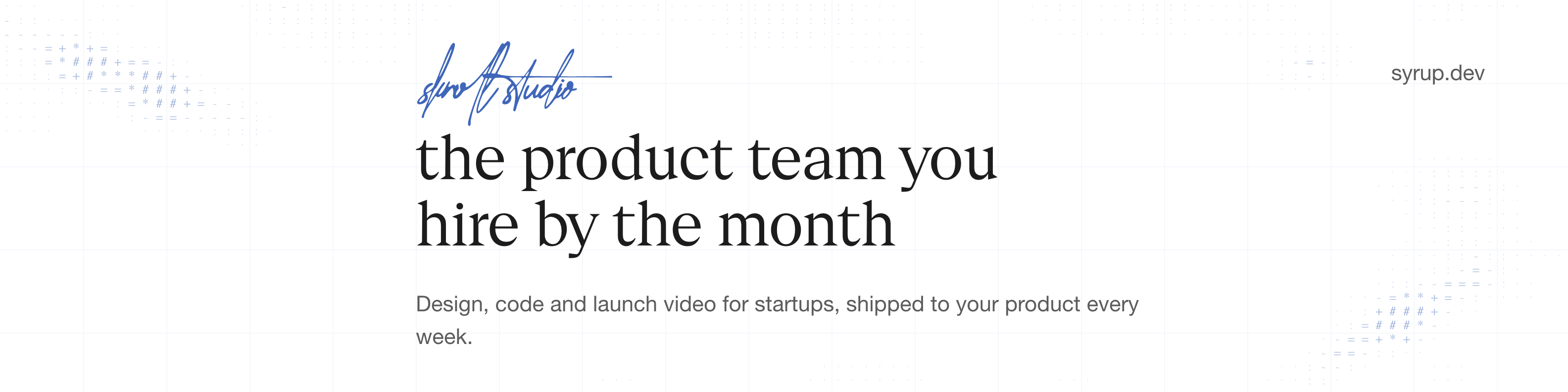
LinkedIn banner, 1584 × 396. Download the 2× file below 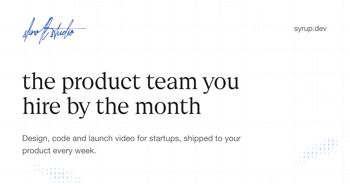
Share image, 1200 × 630. Download the 2× file below
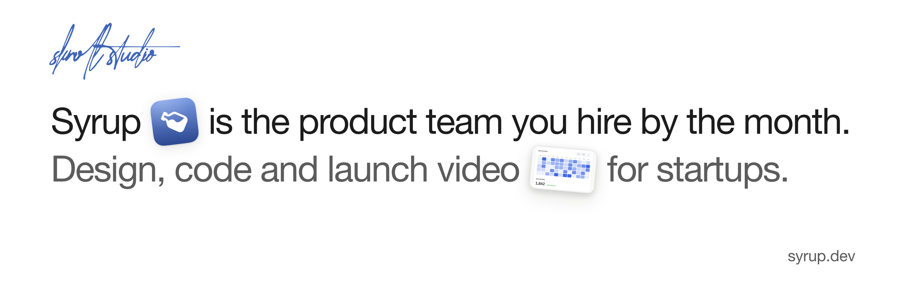
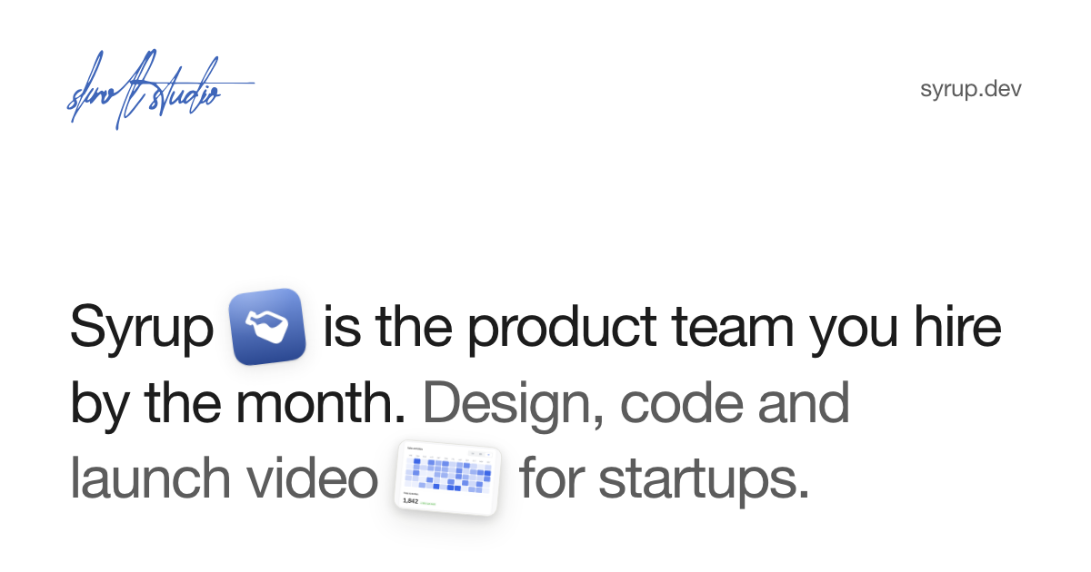
- X headerPNG · 3000 × 1000Download
- Facebook coverPNG · 1640 × 624Download
- LinkedIn bannerPNG · 3168 × 792Download
- Profile picture, the tilePNG · 800 × 800Download
- Share imagePNG · 1200 × 630Download
- Signature, penSVGDownload
- Signature, whiteSVGDownload
- Signature, whitePNG · 1200 × 560Download
- Signature, white squarePNG · 1024 × 1024Download
- Bottle mark, inkSVGDownload
- Bottle mark, whiteSVGDownload